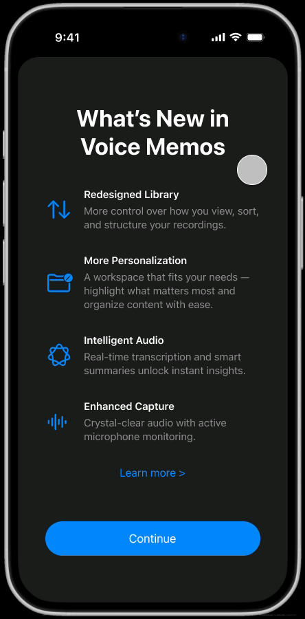
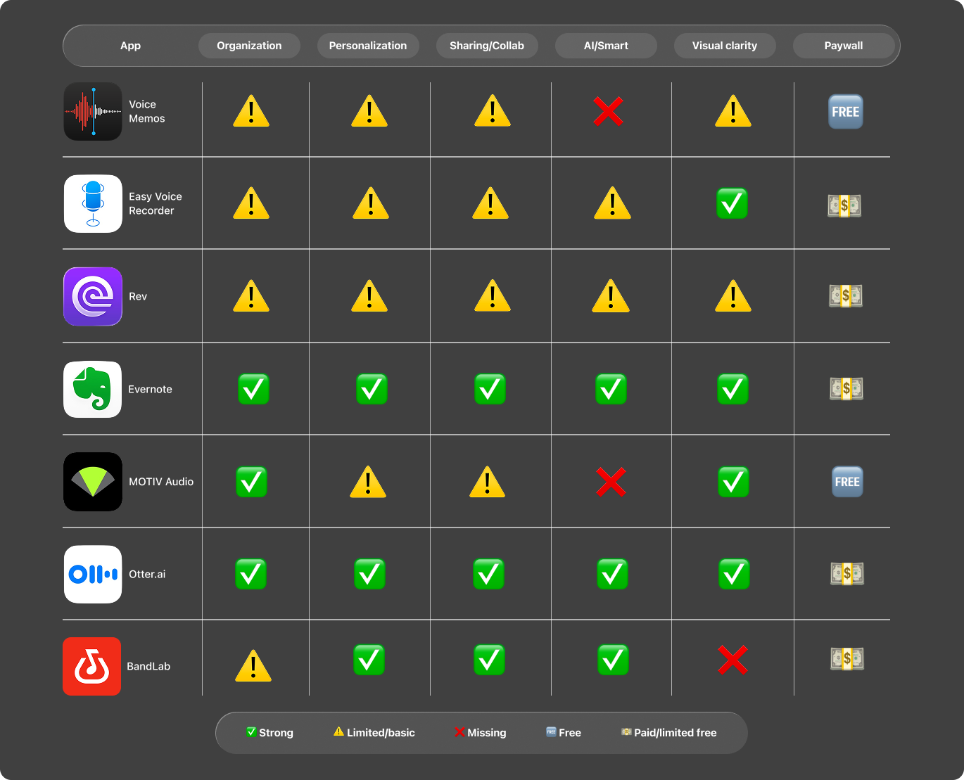
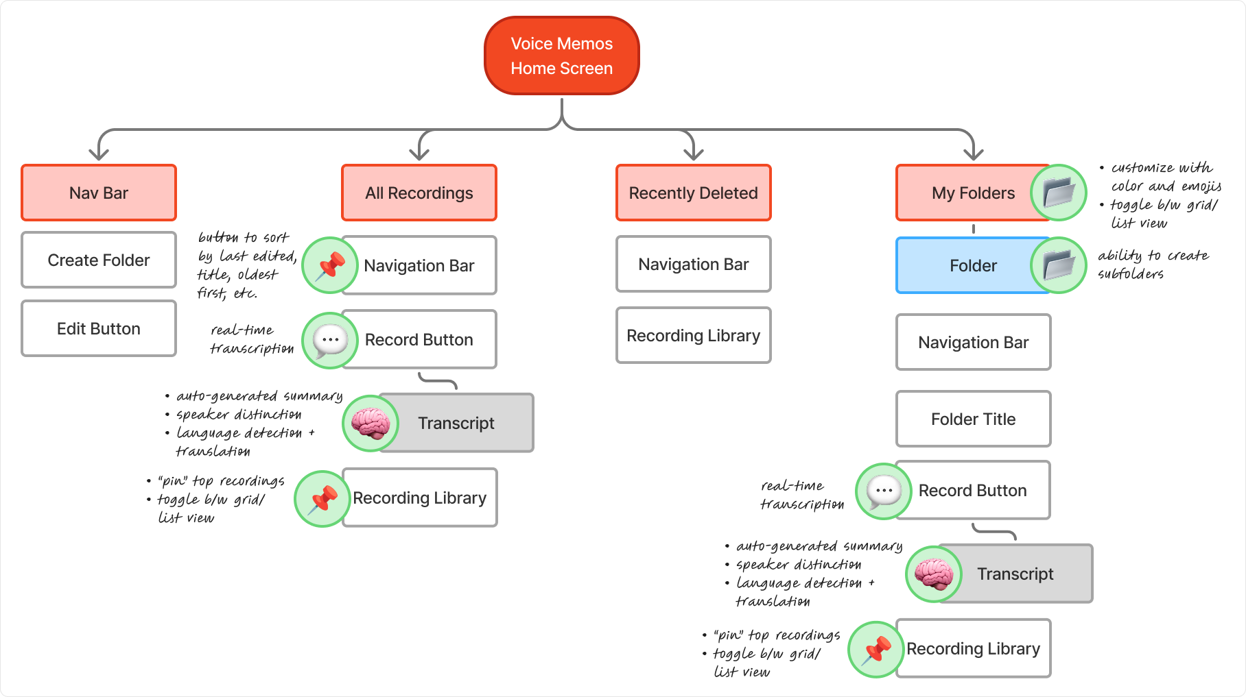
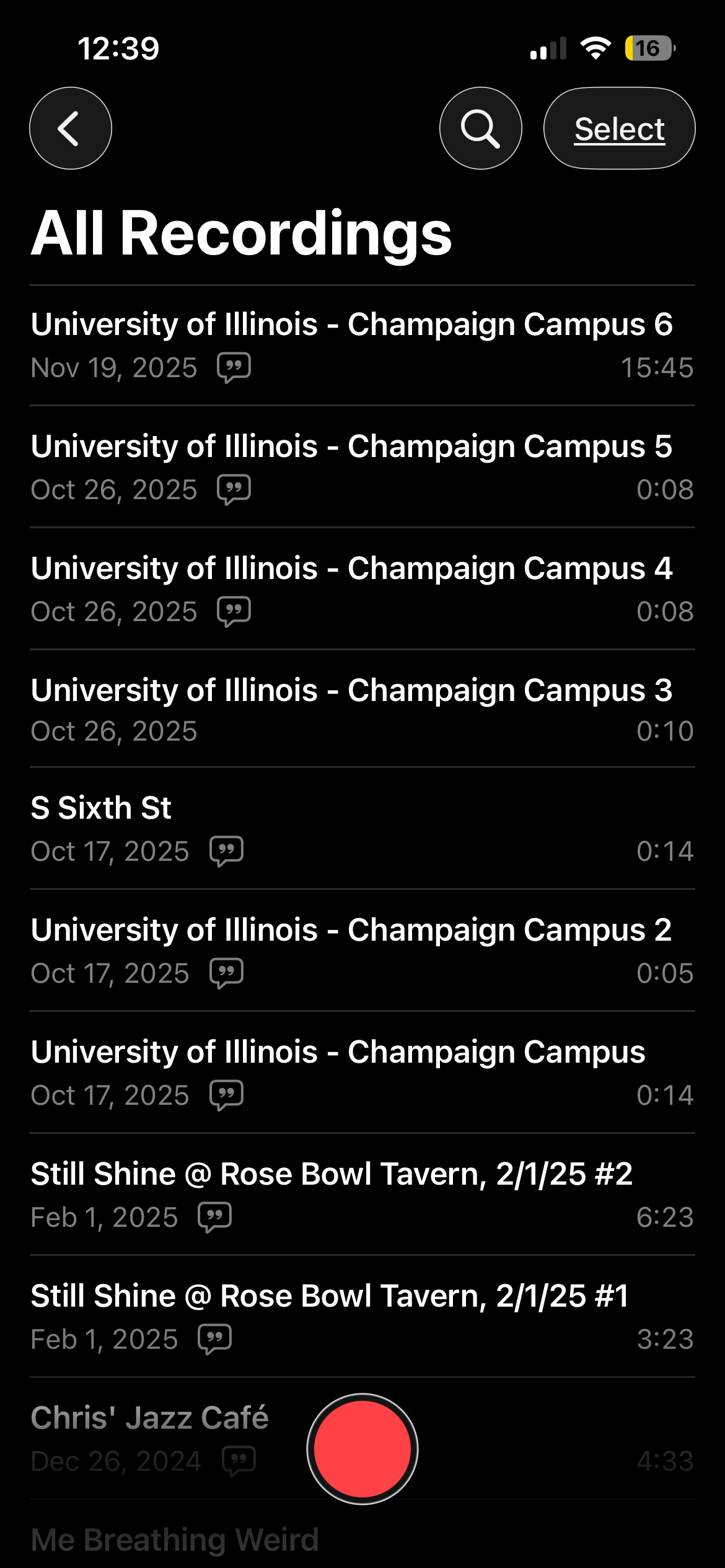
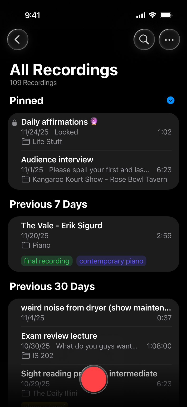
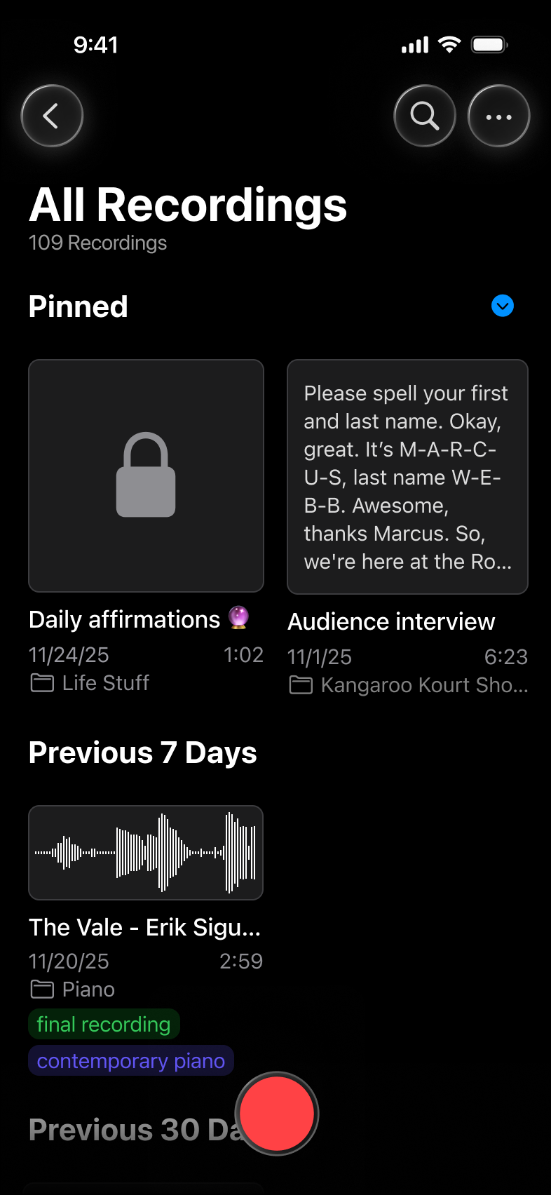
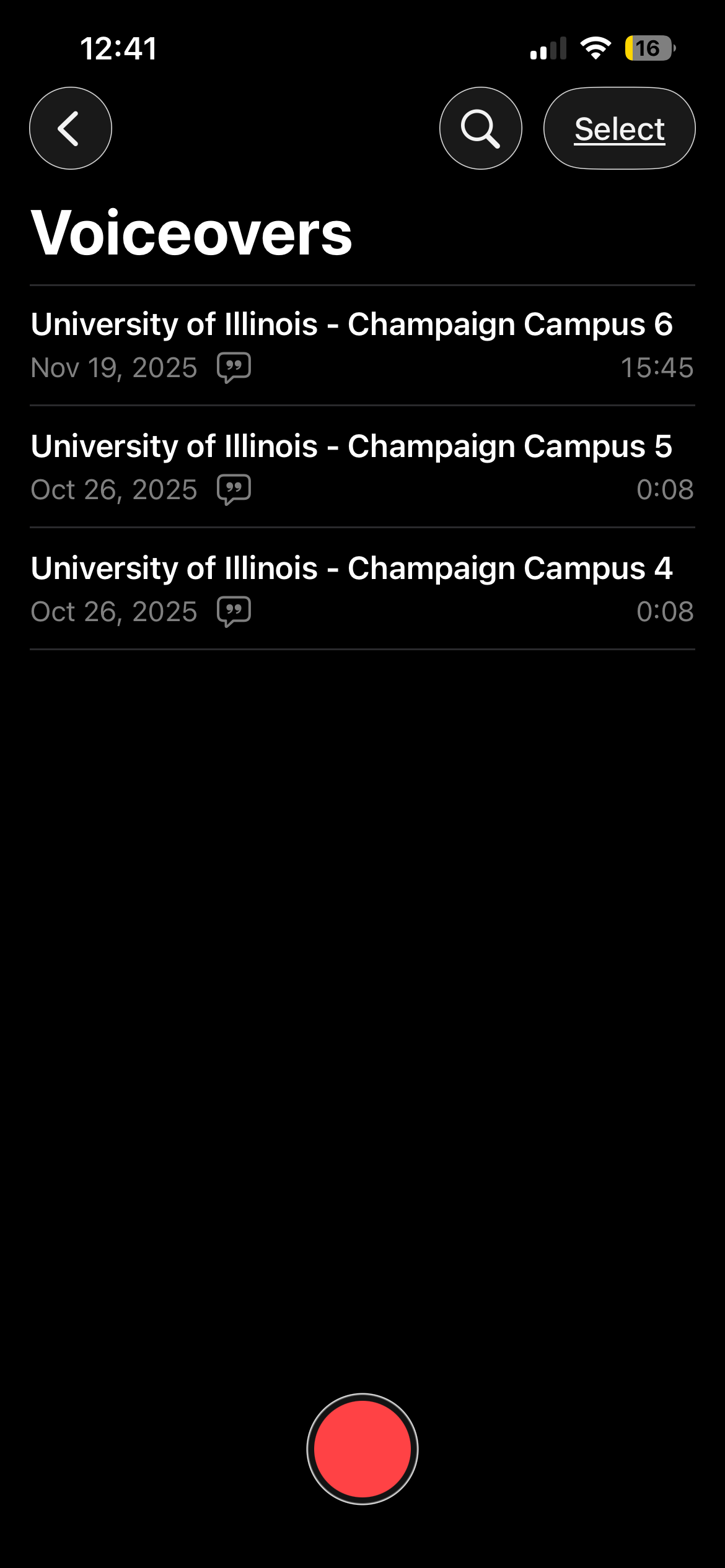
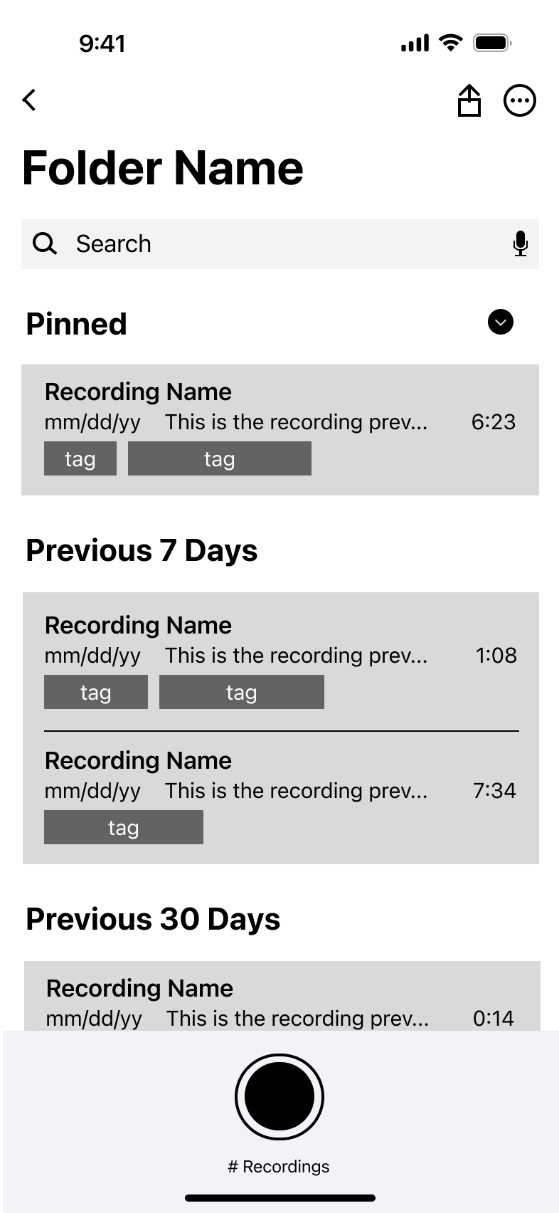
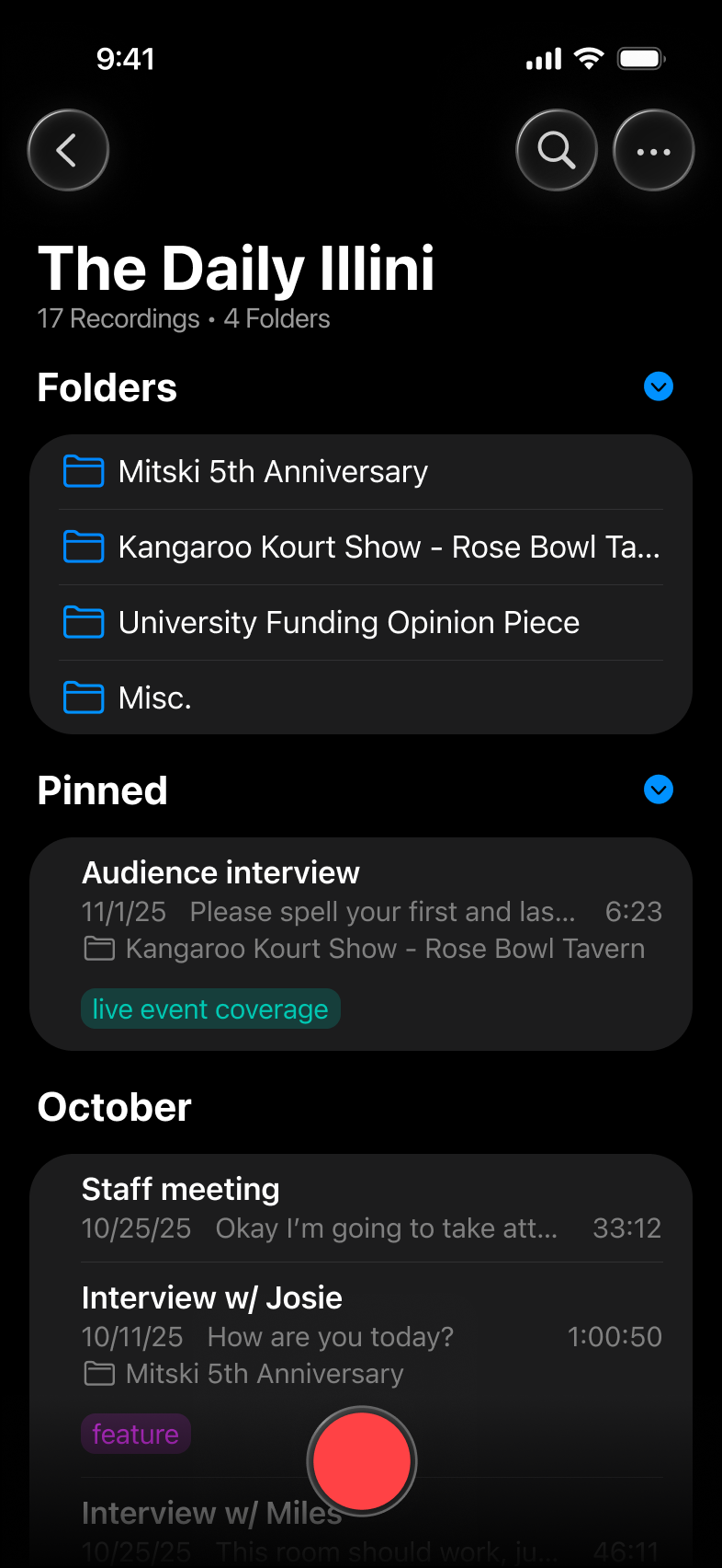
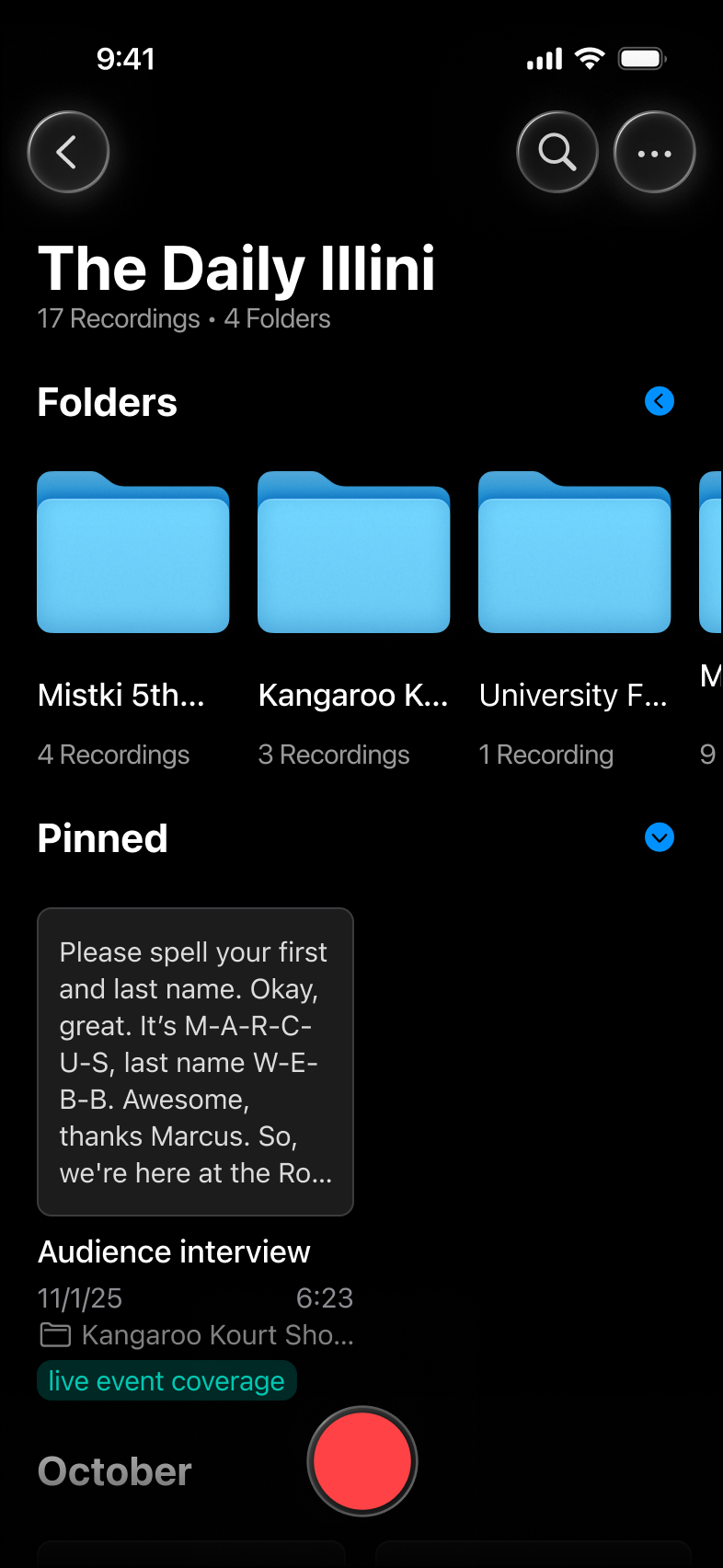
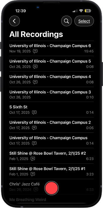
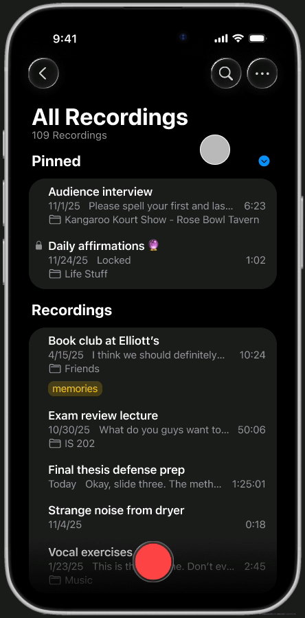
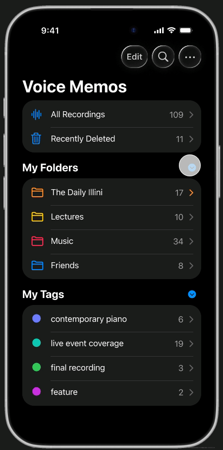
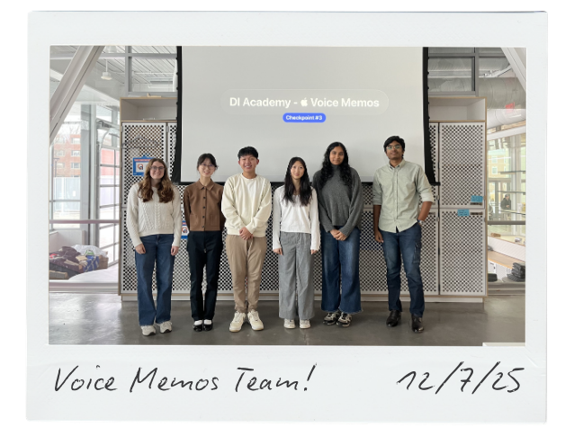
Apple Voice Memos

Redesigning the Voice Memos app into an intelligent, clutter-free hub for brainstorming and documentation.

This is a student concept project and has no official association with Apple.

TIMELINE

Sep 2025 - Jan 2026

TEAM

1 Lead, 5 Designers

ROLE

UX Designer

SKILLS

• User research
• Competitor research
• Collaborative design
• UX design

Tools

• Figma
• FigJam

BACKGROUND

Why Voice Memos?

As a member of Design Innovation, a UX design collective at the University of Illinois, each semester means taking on a new redesign project with a team of fellow students. Reimagining the Voice Memos app presented a unique opportunity to immerse ourselves in the design ecosystem of Apple, one of the world's most valuable brands.

Problem

Apple describes Voice Memos as a "portable audio recorder" for capturing everything from family moments to classroom lectures. While the app succeeds in simplicity and quick audio capture, it ultimately feels underutilized and outdated.

Approach

Apply a human-centered approach to redesign the Voice Memos app, leveraging user interviews and competitor research to upgrade organization tools and integrate AI capabilities.

SOLUTION

A clutter-free, intelligent workspace that enhances how you document your ideas and life experiences.

Complete with an iOS-style onboarding experience to introduce users to the new features developed in this redesign.

to navigate prototype

"R"

to restart

See the final redesign

The Process

PAIN POINT AUDIT

By using Voice Memos ourselves, we became familiar with its interface and identified areas where the app felt incomplete or frustrating.

Low visual hierarchy

The flat design lacks contrast, and the inability to customize sort order (e.g., by title) makes recording retrieval overwhelming.

Rigid organization

Folders lack visual distinction, and the inability to create subfolders restricts how you manage complex libraries.

Manual identification

You're forced to listen to full recordings or read through dense transcripts to recall content, missing out on efficiency and insights that AI automation could provide.

UNDERSTANDING USERS

We spoke to 12 users from varying backgrounds to understand how they use Voice Memos.

Our questions covered recording habits, organization, accessibility, and personalization. We clustered this data into common themes to reveal key insights.

→ Organization needs visual cues

Users struggle to retrieve files based on text names alone. They desire visual markers, like color coding, icons, and folders, to group related files and reduce cognitive load.

→ Recordings lack glanceability

Searching through recordings is a tedious process. Users feel frustrated that they must listen to a file to know its contents, highlighting the need for context at a glance.

→ A sandbox, not a studio

Users view Voice Memos as a transient space for brainstorming and rough ideas, rather than a destination for producing final products.

ASSESSING COMPETITORS

What are other apps in the audio recording space doing right?

Examining similar software clarified which Voice Memos features to keep intact and which to improve or expand.

SECONDARY RESEARCH

To capture perspectives our users may have missed, we noted online feedback about Voice Memos.

Grasping how the broader public uses the app helped round out our findings and increased our ability to propose effective features down the line.

Main use cases

Conversations, interviews, language practice, note taking, journaling, and music.

→ Voice memos is valued for its simplicity and convenience

...but lacks advanced functionality like accurate transcription, speaker differentiation, and multi-track editing — leading users to rely on third-party tools for more flexibility.

guiding question

How might we transform Voice Memos from a basic recorder into an intelligent hub for effortlessly organizing and understanding ideas?

opportunities

User insights and competitor research revealed four potential features for the redesign.

📌

Efficient retrieval

Flexible sorting options and the ability to "pin" top recordings for immediate access

💬

Live transcription

Real-time text generation during recording to provide visual feedback

📁

Custom folders and tags

An expanded organization system that lets users group recordings by project or topic with custom, multi-level folders and tags

🧠

Apple Intelligence

Auto-generated titles and summaries to improve context at a glance, as well as language detection and translation for better accessibility

WHERE WE FIT IN

Before jumping into design work, mapping the app's information architecture helped us identify natural entry points for our features.

While some details changed as we gathered feedback, this was a useful starting point.

My role

I was responsible for redesigning the “All Recordings” and "Folder Recordings" screens.

I looked to Apple's Notes app as a primary influence because of its similar mental model and role in the iOS ecosystem. Much like how an author might use Notes to capture fleeting ideas rather than write whole novels, Voice Memos serves as a space for quickly documenting raw, spontaneous ideas.

All Recordings Screen

Current Design

Text-heavy list lacking visual hierarchy. Users must read titles or play audio just to identify files.

Wireframe

Restructured the list with a "Pinned" section and time-based grouping to break up the endless scroll.

Redesign - List View

Added color-coded tags for scannability and moved the search bar to the bottom for better reachability.

Redesign - Gallery View

Maximizes space with card-based previews (waveforms & transcripts) for instant visual identification.

Folder Recordings Screen

This part of the redesign was similar to the "All Recordings" screen, but with a few notable differences.

Current Design

Limited to one level of organization. Users cannot create subfolders to manage complex projects.

Wireframe

Eliminated redundant labels and introduced the ability to share entire folders at once.

Redesign - List View

Enables nested subfolders and colored tags to organize multi-level directories.

Redesign - Gallery View

Mimics the MacOS Finder experience to visually separate folders from recordings.

feedback

At the end of the semester, we presented our final redesign at the last Design Innovation checkpoint.

Here’s what some of our fellow members had to say through an anonymous feedback form:

"As someone who frequently uses Voice Memos, this is something I would really like to see implemented in real life and would find useful for organizational purposes.”

"Love that your HMW adjusted as you gained more insights and feedback... I honestly don't have feedback notes.”

"I think these changes would definitely help users use the app more and better utilize their voice recordings. Great to see everything you guys learned!”

See the full redesign and my team's work! If the slides appear cropped, click "Settings" > "Other scaling options" > "Fit width and height."

GOING FURTHER...

I conducted an independent design sprint to polish the redesign.

Design work is never truly over (plus, I just couldn't help myself).

I continued refining the redesign over winter break, identifying areas where features could be expanded and use cases we had missed during the initial process. This extra round of iteration allowed me to better align the interface with Apple’s latest design system and refine the details that matter.

The Final Redesign

Library organization

Recordings are grouped by date by default, with various sorting options (title, date created, and more) available to help you scan your recording history at a glance.

Current Design
Redesign

Priority and privacy

Long-press any recording to access quick actions like pinning and locking. Keep confidential files private and high-priority content at the top of your library, ensuring nothing gets buried.

Current Design
Redesign

Tags

Add a flexible layer of organization that works across different folders. Tags allow you to group recordings by context, like project or priority, independent of their file location.

Current Design
Redesign

Customization

Give your folders some personality with unique emojis and colors that come alive in the new Gallery View — making it easier to spot the right project instantly.

Current Design
Redesign

Transcription

Real-time transcription automatically distinguishes between speakers, so you never lose track of who said what. To focus on specific contributions, filter the transcript by individual speakers.

Current Design
Redesign

AI summaries

Apple Intelligence extracts key points automatically. Mark them with the new highlight feature, allowing you to capture the essentials without needing to re-listen to the whole recording.

Current Design
Redesign

Mic monitoring

Never lose an idea to a muffled microphone again. A new smart alert notifies you instantly if your audio isn't being picked up clearly, ensuring every recording is usable.

Current Design
Redesign

REFLECTION

What I learned from my first semester with Design Innovation

→ Getting comfortable with Figma
This project's scope pushed me to use efficiency tools like Auto Layout, improving my ability to prototype and work within a design system.
→ The importance of user research
This one is no secret, but putting it into practice reinforced that good design cannot rely on guesswork. Interviewing users to uncover their pain points, and then designing directly for those needs, helped me move beyond assumptions and ground my decisions in evidence.
→ Constraints, constraints, constraints
I’ve heard this word often in the design world, but I never truly grasped its impact until this project. As students, we had limited time, resources, and access to users. I’m proud of the work we delivered in spite of those hurdles.
→ Collaborating from start to end

I was grateful to have a team throughout the entire design process, from user research to iterative feedback. This experience was invaluable for learning how to articulate design rationale and process feedback — skills I couldn't have built solo.

UP NEXT

While you're here, check out some of my other work!